
Guide
Book Layout: How to Lay Out a Book Interior
What is on a book page and why it sits where it does, the handful of typesetting rules that make text read well, what separates layout from typesetting from formatting, and the software that does the work. For the inside of the book, not the cover.
By Corey Jackson, developer of Lacuna
Reviewed by Melissa Erin Jackson, author of 15 self-published books
Updated October 5, 2026 · Read about us
The anatomy of a page
The parts of a book page, in the words typesetters use for them. Every layout decision is one of these.
| Part | What it is |
|---|---|
| Trim | The finished page after cutting, width by height. Everything else is measured from it. |
| Text block | The rectangle the body text fills, the same on both pages of a spread. |
| Margins | Top (head), bottom (foot), outside (fore-edge), and inside (gutter). The gutter grows with the page count. |
| Headers and footers | The lines in the top and bottom margins. KDP puts the author’s name in the header on left-hand pages and the book title on right-hand pages; the page number sits in the header or the footer. |
| Folio | The page number. Front matter takes lower-case roman numerals. |
| Measure | The length of a line of text, counted in characters. 45 to 90 reads easily. |
| Leading | The distance from one baseline to the next, in points. Named for the strips of lead once set between lines. |
| Chapter opener | The first page of a chapter: no header, and a first paragraph with no indent, perhaps with a drop cap. |
| Recto and verso | Right-hand and left-hand pages. Rectos are odd-numbered; the title page and chapter one sit on them. |
| Spread | Two facing pages seen together, the way a reader sees them. |
Eight layout principles
Typesetting has a few rules with numbers in them and a few with none. These are the ones that decide whether a page reads like a book.
Measure: 45 to 90 characters a line1
Two to three lowercase alphabets of the typeface is the same rule in different units. A 6 x 9 page at 11 point holds about 69.
Leading: 120 to 145 percent of the size2
Eleven-point type on 13.5 to 15 points of leading. Word processors’ single, 1.5, and double presets are about 117, 175, and 233 percent, and miss the range from both sides.
Size: 10 to 12 point in print3
Nearly every book, newspaper, and magazine is set under 12 point. The size and the measure trade off against each other on a fixed page, so set them together.
Paragraphs take a first-line indent of one to four times the type size, with no space between them. The first paragraph of a chapter takes no indent.
Book text is justified, and justified text needs hyphenation turned on, or the word spacing opens up line by line.
No widows, orphans, or stranded heads5
No paragraph leaves a single line alone at the top or bottom of a page, and no subhead sits at the foot of a page with its text overleaf.
The title page and chapter one open on right-hand pages, and later chapters on the next available page. Chapter openers carry no header, and blank pages no page number.
Consistency over cleverness
One body style, one heading style per level, one treatment for ornamental breaks, captions, and block quotations, from the first chapter to the last.
Typesetting, layout, and formatting
Three words for overlapping jobs. Knowing which is which tells you what you are paying for and what a program does.
Typesetting
The setting of the text itself: face, size, leading, measure, justification, hyphenation, kerning, and the line-by-line fixing of bad breaks. The oldest of the three and the one that still takes an eye.
Layout
The design of the page around the text: trim, text block, margins, headers, folios, chapter openers, images and captions. Decided once per book and repeated; in a page-layout program, built page by page.
Formatting
Self-publishing’s word for the whole job, from a manuscript to a print PDF and an EPUB, including the parts the other two never had to think about: the reflowing ebook, the printer’s margin rules, EPUBCheck.
A hired typesetter does the first two by hand. Book formatting software does all three from a style you choose, which is why it can make a second edition, a large-print edition, or the ebook from the same project without starting again. The book formatter guide puts prices on both routes.
How to lay out a book interior
Six steps on a real 6 x 9 page. Click through them and change the settings; the numbers come from Lacuna’s default margins and the same copyfit as the words-to-pages calculator.
Lacuna’s 6 x 9 margins leave a 4.75 x 7.5 inch text block. The gutter is the widest margin, on the binding side.
4.75 x 7.5 in
The margins in step one are Lacuna’s defaults for a 6 x 9, above KDP’s gutter minimum at any page count.7 The book sizes guide covers the trim; the how-to-format-a-book guide covers everything around the layout, from front matter to proof.
Book layout software
Two kinds of program lay out a book. One applies a layout to the whole manuscript; the other gives you a blank page.
Book formatting software
- Import the manuscript; every chapter takes the same layout
- Choose a style, or build your own, and change it in one place
- Images, tables, and footnotes and endnotes flow with the text
- The print PDF, the EPUB, and a DOCX from one project
Lacuna: Windows, Mac, and Linux, $149 one-time, 32 pre-made styles.
A layout you choose, applied to every page
Lacuna’s 32 pre-made styles are complete layouts: type, leading, measure, chapter openers, headers, folios, and break rules, each designed once and applied to the whole book.
Click any screenshot to see it full size.
The page, checked
Trim size in inches or millimeters, margins and gutter checked against KDP’s minimums for your page count, bleed when you need it, and guideline overlays in the preview.
The typesetting rules, built in
Widow and orphan control, hyphenation control, justification options, page spread balancing, and per-section headers and footers, as settings rather than hand work.
Print and ebook from one project
The layout feeds the print PDF; the structure and type feed an EPUB built to pass EPUBCheck, and a DOCX comes from the same project. Write and format in the same app, on Windows, Mac, and Linux.
The trial is free with no time limit and every feature switched on. The one thing payment unlocks is generating the final files, so you can lay out the whole book and read every spread before you spend $149, one time.
What authors are saying
Real authors. Real books. Formatted with Lacuna.
I’m a cover designer and interior formatter by profession and run my own small publishing press, so trust me when I say I’m picky and my standards are high. InDesign has always been the only program that formats for print with the level of customization I need. For years, I’ve used it for print and another program entirely for ebooks to get the results I wanted. When I saw Lacuna, I immediately went to check it out and within an hour from having downloaded the trial, I was hooked.
This gives me so much more freedom with print options than other formatting programs like Atticus or Vellum while still making ebooks a breeze. The ability to work from one file and have separate print and ebook settings is a complete gamechanger. I’m still learning my way around the program and loving every second.
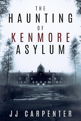
JJ Carpenter
The Haunting of Kenmore Asylum
I originally checked out Lacuna because somebody in a KDP publishing group I belong to asked if anyone had tried Lacuna out yet. I published nine other books using a different formatter, but I wasn’t happy with it. I ended up taking a look at Lacuna even though I was pretty much sold on Atticus or Vellum. Once I started diving into Lacuna and saw the ease of use and flexibility, I was absolutely floored. It was a no-brainer, and I purchased Lacuna. Since then the program has only improved. Corey is amazing at fixing things and streamlining processes.
If you take a look at the book that I formatted with Lacuna you will see, it would be pretty difficult to do something like that with one of those other formatting programs. Plus they cost more. In my opinion Lacuna is already the best formatter on the market and only getting better. Thanks, Corey and Melissa, for making this available.
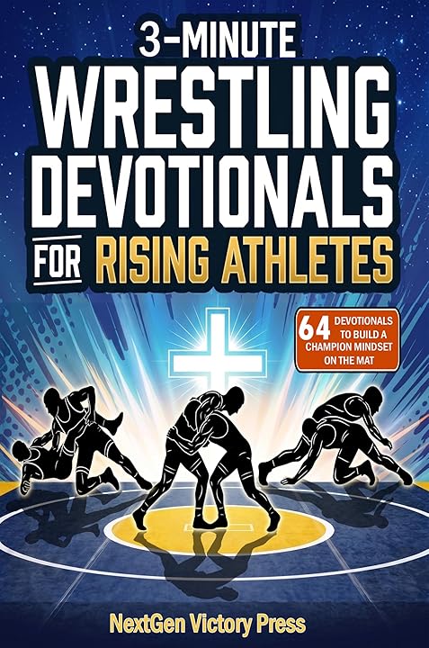
NextGen Victory Press
3-Minute Wrestling Devotionals for Rising Athletes
I tried numerous formatting methods and followed endless instructions from publishing websites, but nothing ever turned out right. Since finding Lacuna, everything has changed. I’ve been able to update all my manuscripts effortlessly and give them the professional look they deserve.
Lacuna helped me perfect one of my most cherished stories, The Magic Globe, and finally present it exactly as I envisioned. It’s truly been a game changer for my author journey.

Samuel Graham Astley
The Magic Globe
Book layout questions
What authors ask when the manuscript is done and the page is still blank.
Sources
- Line length, Butterick’s Practical Typography: “an average line length of 45–90 characters, including spaces”. Checked 2026-10-05.
- Line spacing, Butterick’s Practical Typography: 120 to 145% of the point size; word processor presets about 117, 175, and 233%. Checked 2026-10-05.
- Point size, Butterick’s Practical Typography: 10 to 12 point in print; nearly every book set smaller than 12. Checked 2026-10-05.
- First-line indents, Butterick’s Practical Typography: an indent of one to four times the point size; justified text needs hyphenation. Checked 2026-10-05.
- Line and page breaks, Microsoft: widows, orphans, and Widow/Orphan control, on by default. Checked 2026-10-05.
- Format front matter, body matter, and back matter, KDP: right-hand pages, headers, chapter openers, indented paragraphs with no space between. Checked 2026-10-05.
- Set trim size, bleed, and margins, KDP: gutter by page count, 0.25 in outside margins. Checked 2026-10-05.
- Book design, Wikipedia, citing the Chicago Manual of Style: page numbers off blank pages and chapter openers, roman numerals in the front matter. Checked 2026-10-05.
- Adobe InDesign, Adobe: “A professional page layout application for print and digital publishing”, US$22.99 a month on the annual plan, billed monthly. Checked 2026-10-05.
- Affinity, Canva: free for individuals, with page layout, on Mac and Windows. Checked 2026-10-05.
- Scribus, Open source page layout for Linux, Mac, and Windows; its Flathub listing gives “output in PDF and Postscript”. Checked 2026-10-05.
Lay out the whole book, then decide
Download Lacuna free, import your manuscript, and try the layouts on your own pages. Pay $149 only when you are ready to export.
Want the details first? See all features or view pricing.